Büro 247 is a graphic design studio based in Berlin.
Turtleneck Phantasies

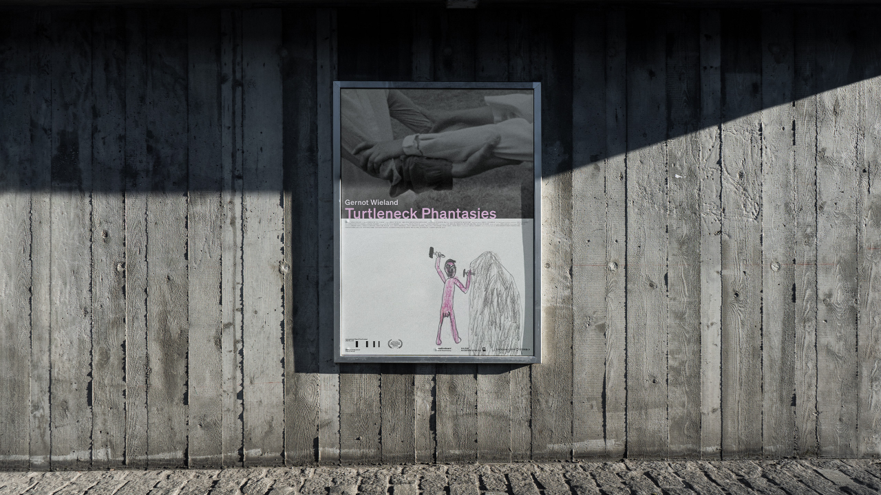
Poster design for the film Turtleneck Phantasies by Gernot Wieland. The author’s life story forms the point of departure for a poetic and fragmented video work.

The film won the main award at the 69th International Short Film Festival, Oberhausen, Germany

Léon Wuidar

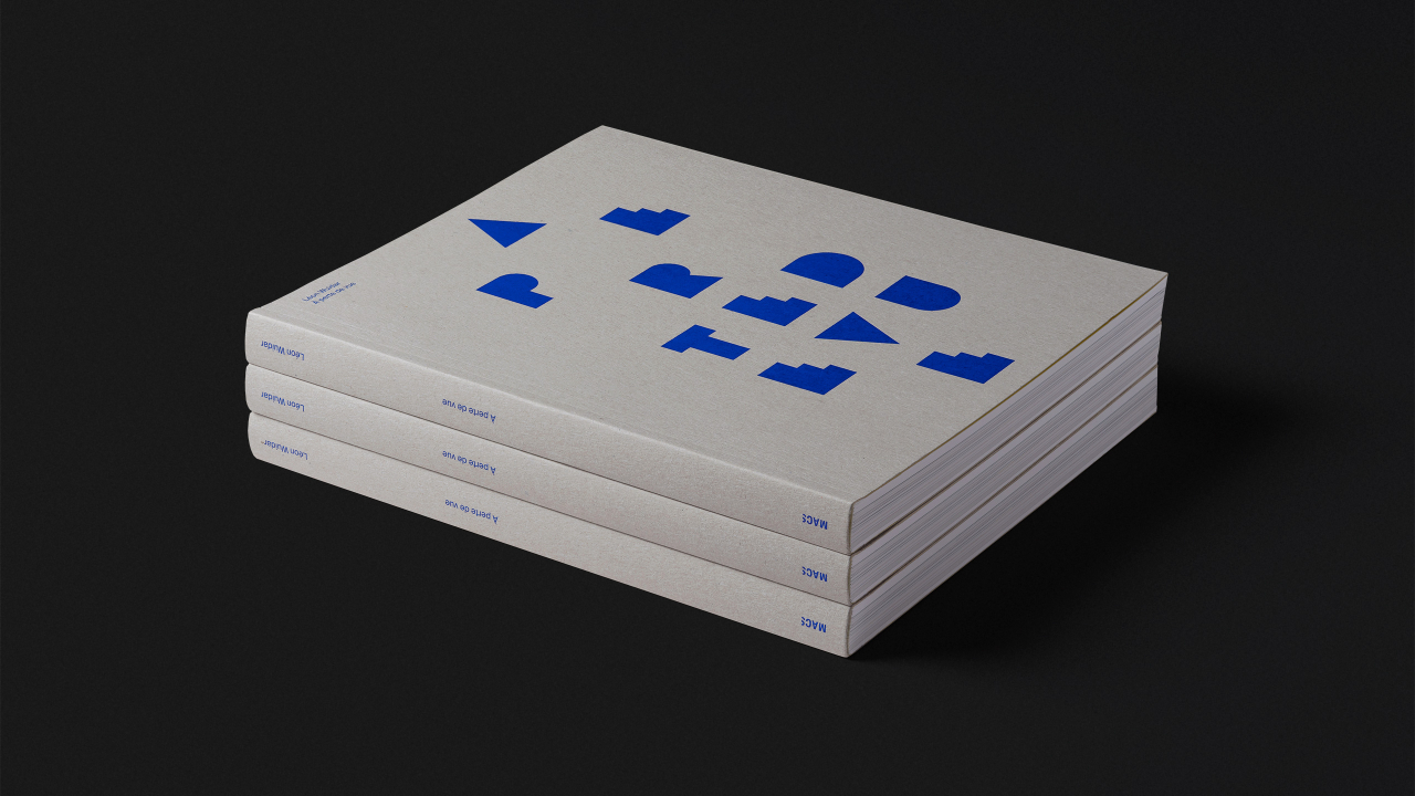
Book and website design for the Belgian contemporary artist Léon Wuidar. For sixty years he has been exploring geometric abstraction, informed by architectural light, space, volume and perspective.

Designed with Virgile Janssen
Photography courtesy of Rodolphe Janssen

Atelier Paulina Piipponen

Identity and website for the set design studio Atelier Paulina Piipponen. The concept is centred on shadows and blurs. This reflects the dual nature of set design — sometimes a set is the main focus of an image, sometimes it is an unfocused, background element.

Web development by Virgile Janssen

A to z

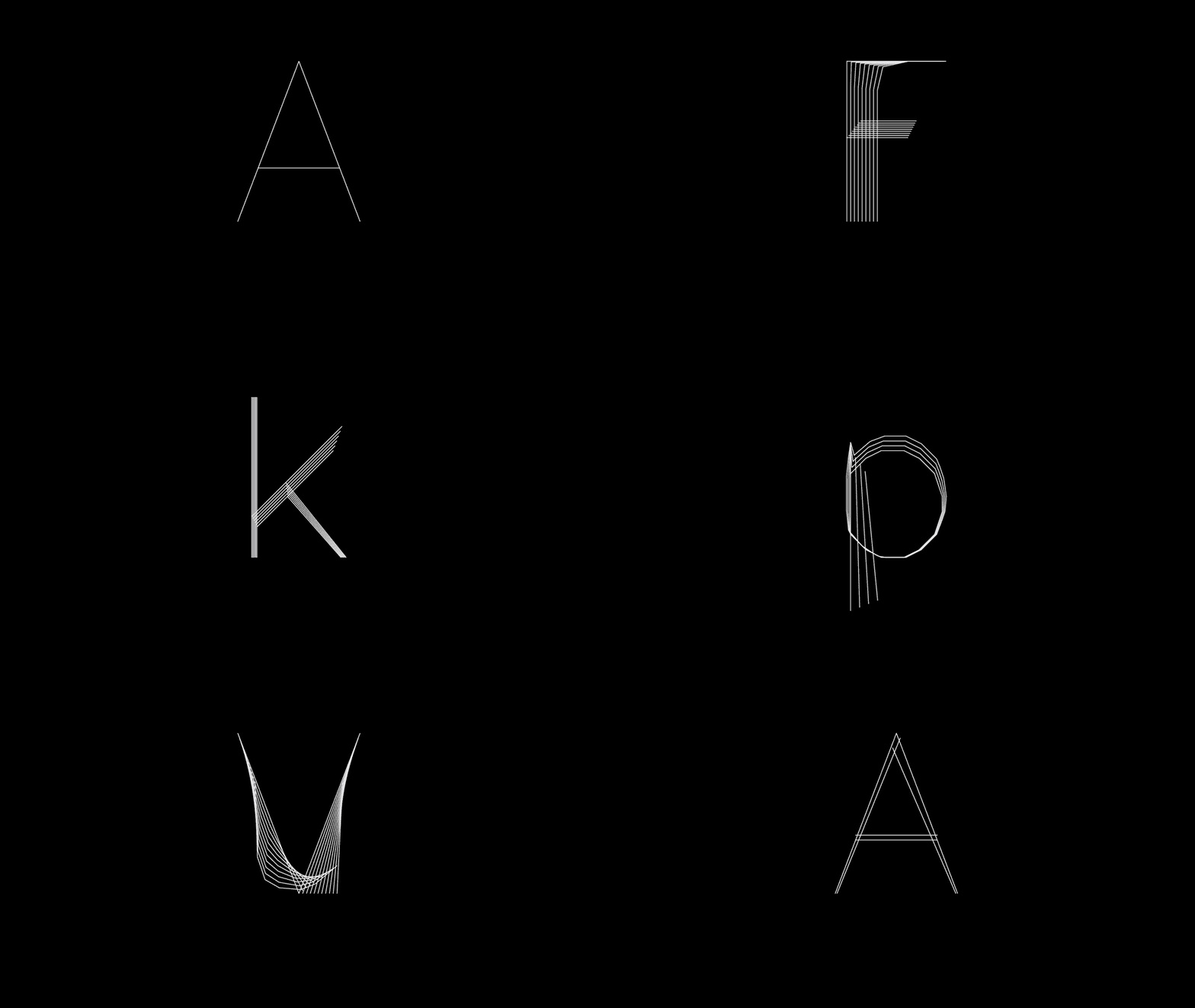
An animation exploring the form and structural connections between characters of the alphabet. The typeface used is a custom skeletal weight of Simplex to emphasise the transitions between characters. Created for the Typeset exhibition as part of Offset, Dublin.

Designed with Amira Prescott
Simplex typeface by Dr AV Hershey, 1967

Upward Spiral

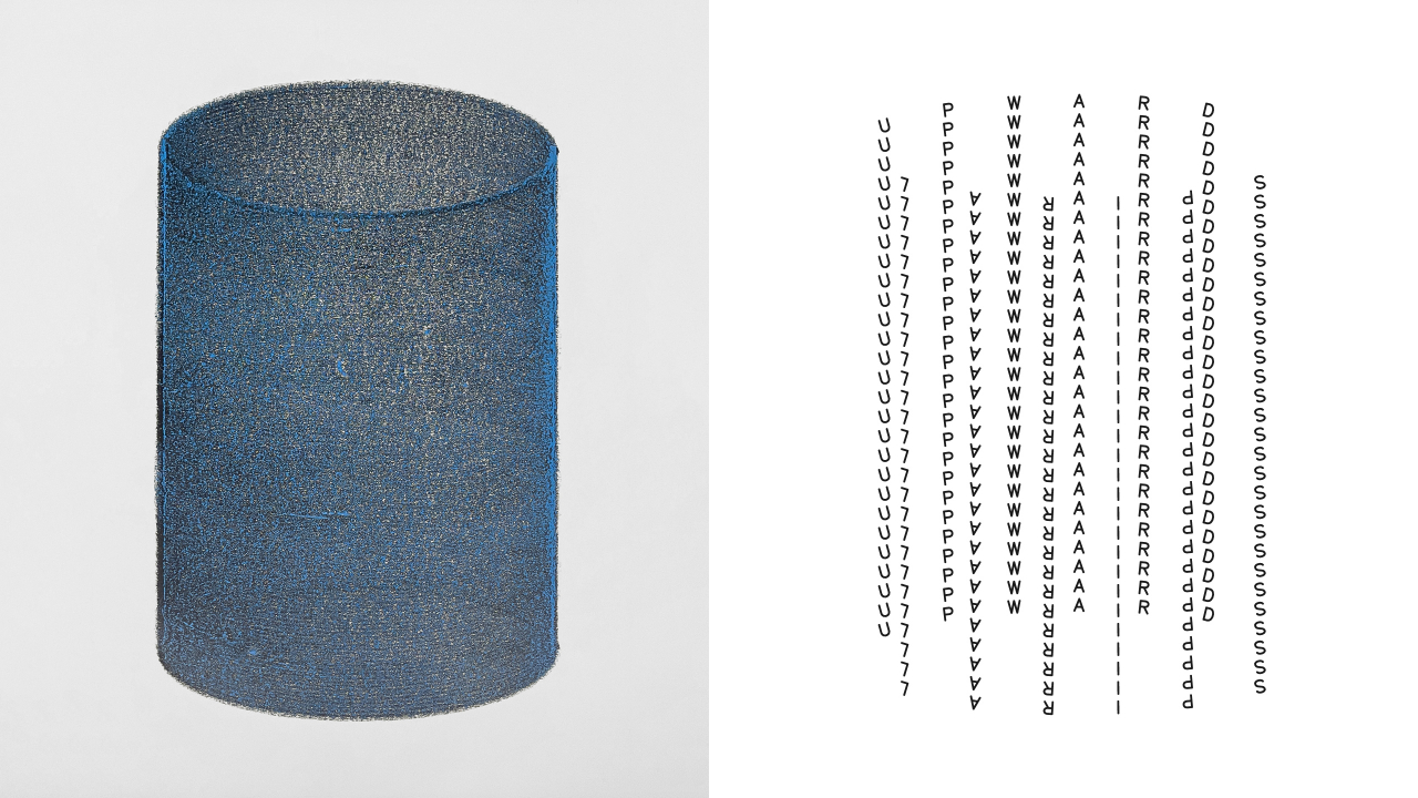
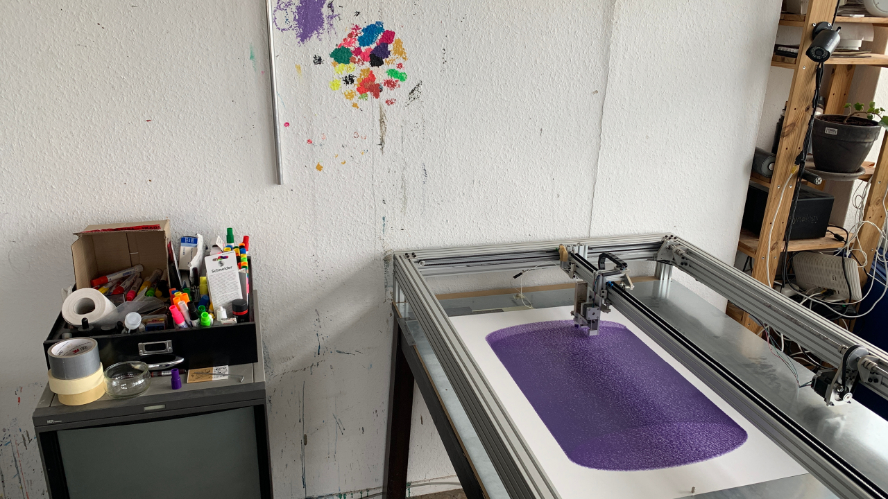
Book design concept for the artist Marcel Schwittlick’s project Upward Spiral. The artworks were produced using a custom-built drawing machine which translates digital geometry into a continuous spiral movement. The design was inspired by this process and the default typography of plotter machines.

Gernot Wieland

Book design for the artist Gernot Wieland on the occasion of his shows at Kunst Halle Sankt Gallen and Salzburger Kunstverein. His work is primarily video essays which juxtapose fact and fiction, horror and humour, and profundity and triviality.

The Labour of Sleep

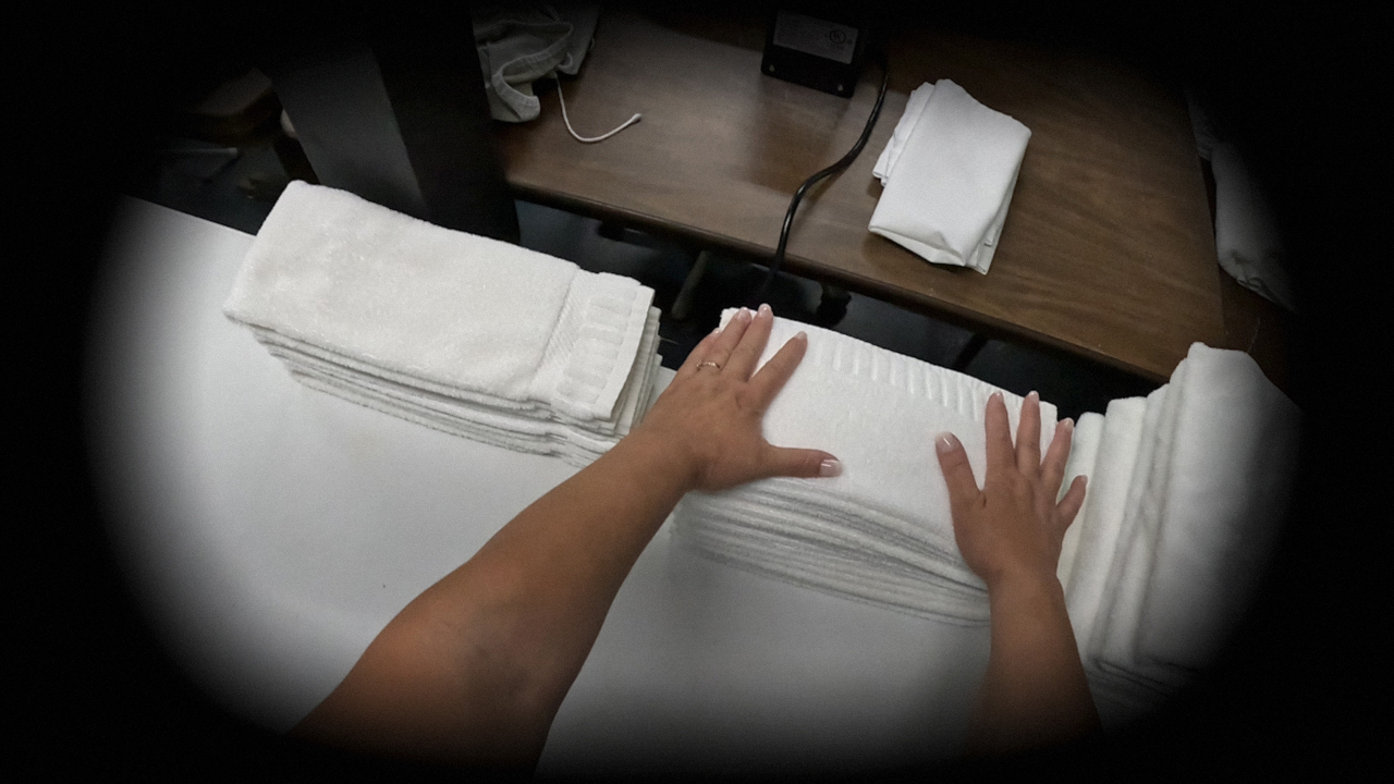
Typography guidelines, slogans and research for the artist Ilona Gaynor’s film which examines labour within the hospitality sector of large chain hotels. In reference to Jonathan Crary’s book 24/7 which states ‘sleep is an uncompromising interruption of the theft of time from us by capitalism’.

Debut at The Sociability of Sleep, Université de Montréal, Canada

Tamara Laï

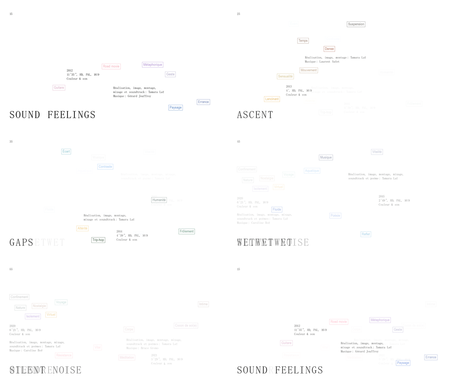
Book design for the multi-media artist Tamara Laï. The majority of her work is screen-based, so we utilised the native 16:9 format, switching orientation for the text and image sections (including our playful rotation of the page numbers). Word clouds introduce the themes of each collection of video stills.

Designed with Virgile Janssen

If I Was Your Girlfriend

Newspaper catalogue designed for the exhibition ‘If I Was Your Girlfriend: A Jam’ at Belmacz Gallery commemorating the anniversary of Prince’s passing. The newspaper deconstructs tabloid culture and celebrity, featuring work by 27 artists and writers.

Belmacz Gallery

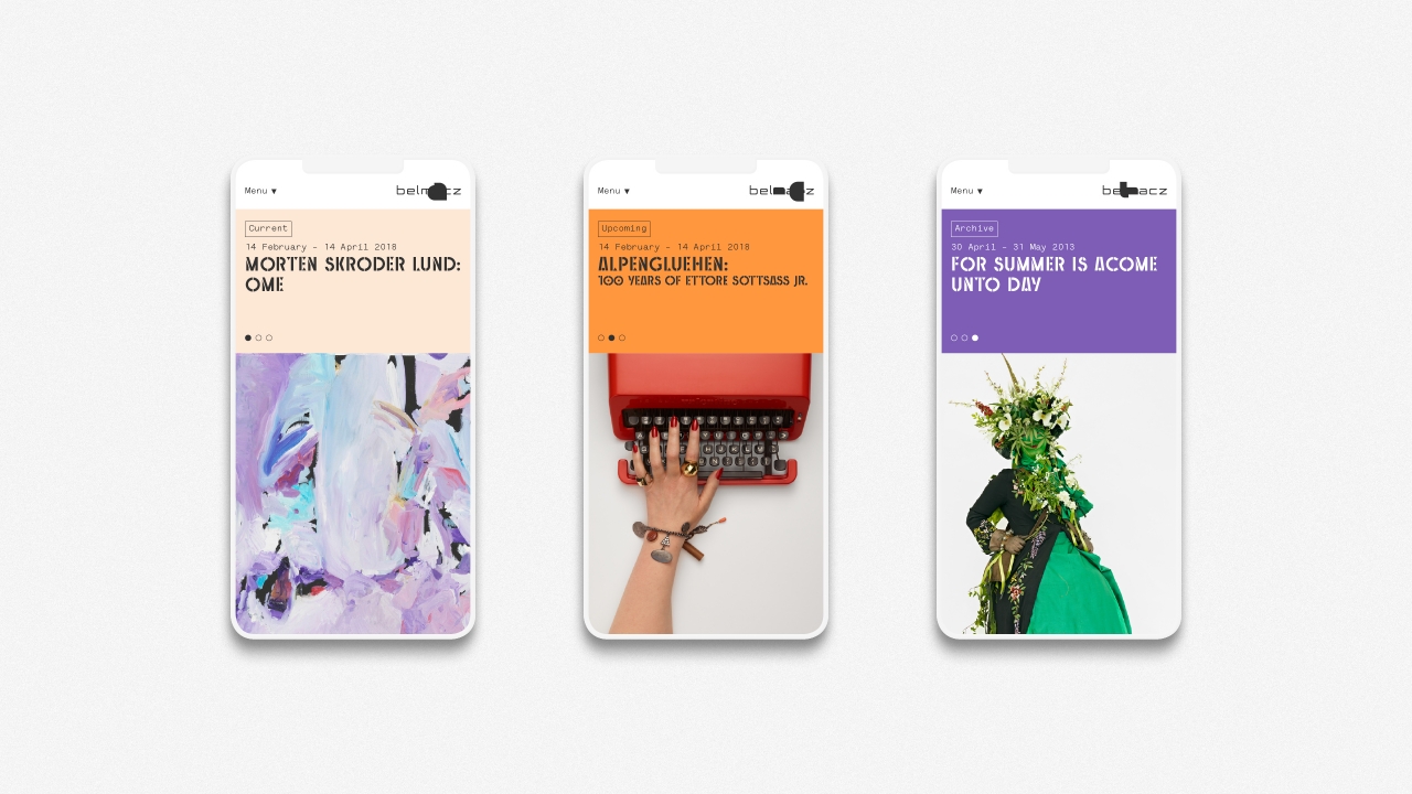
Redesign of the Belmacz Gallery website. The design is a mixture of brutal minimalism and refined elegance to reflect the output of the contemporary art gallery.

Web development by Virgile Janssen

Artworks by Belmacz artists


Muggenburg Grotesk Neue

Bespoke title typeface for Belmacz Gallery, London. It is an update of their Muggenburg Grotesk typeface (itself a direct relation to Kino MT). It uses a more traditional grotesk footprint to aid legibility on and off screen, whilst retaining the idiosyncratic features of its predecessors.

Kino MT by Martin Dovey / Monotype, 1930
Muggenburg Grotesk by Andy Lang / Mind Design, 2006

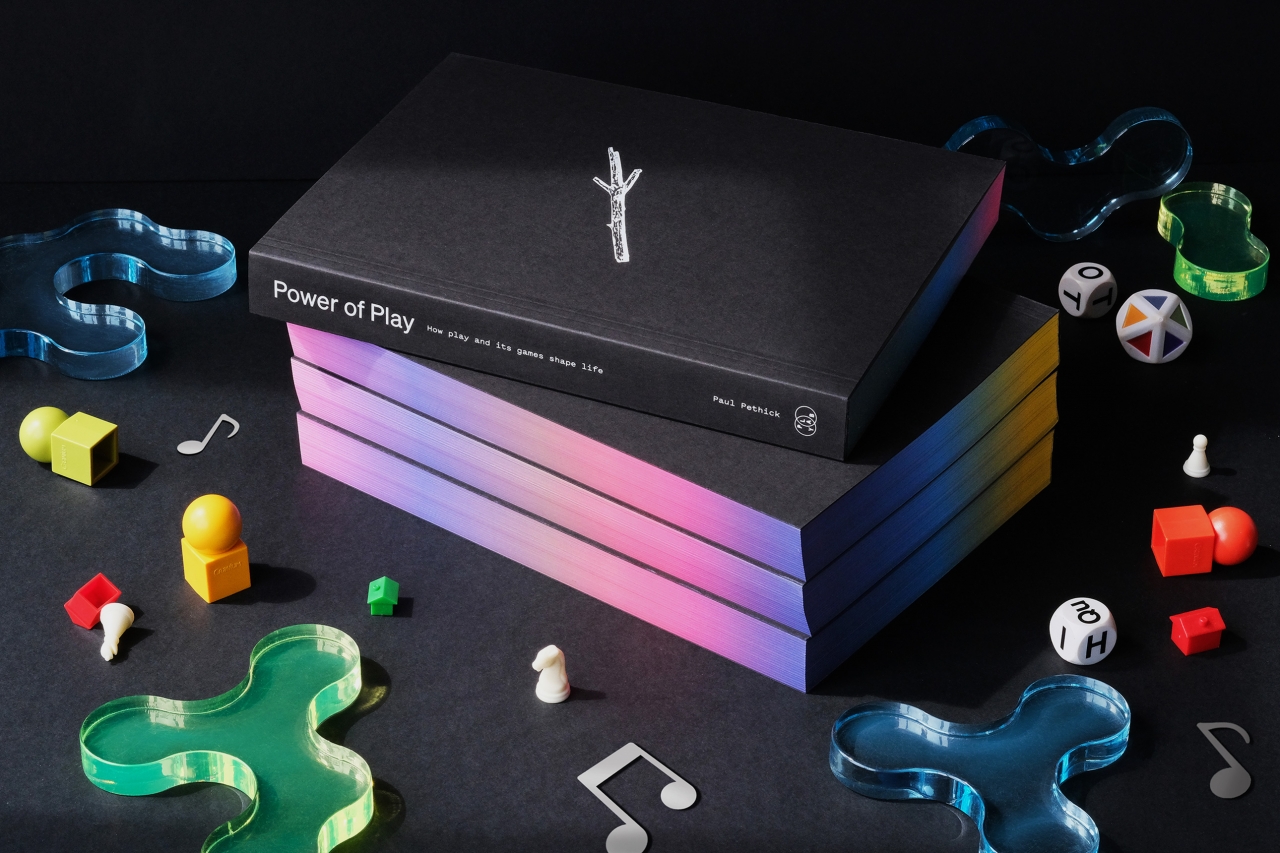
Power of Play

The first book to travel the complete landscape of play, and show why it’s our only real super-power. Extensively researched and sparking with new insights, this book will take you on an evolutionary journey from the smallest workings of the prehistoric imagination, through our development into the endlessly game-playing species we are today.

‘I wish every parent, teacher and politician would read this liberating and joyous book.’ — Brian Eno

Written by Paul Pethick
Available to buy here

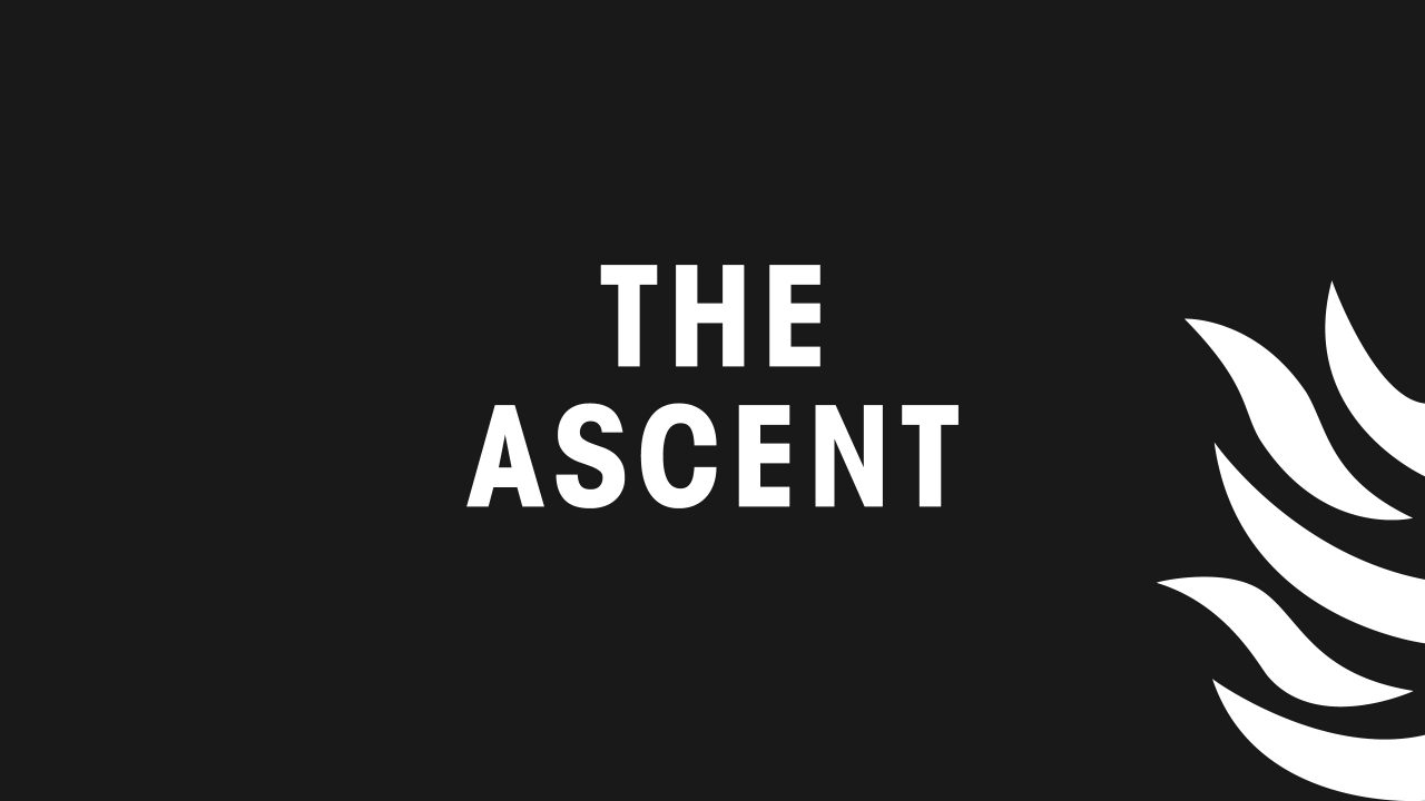
The Ascent

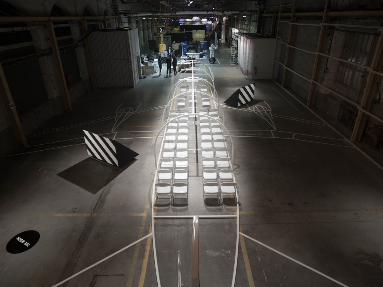
Graphic design for Ilona Gaynor’s carte blanche at the Biennale Internationale Design Saint-Étienne. The subject was a play which is set on an airplane. The set was designed to be bare and indicative — like a scaled-up diagram. The project included set design, typography and a printed script.

Exhibition design in collaboration with Ilona Gaynor

Carla Åhlander

Book design for the photographer Carla Åhlander. She often creates photographic series — softly revealing layers of moments, memories, and histories through her inquisitive observation.

Published by Argo Books

Alpenglühen

Art catalogue published on the occasion of Ettore Sottsass’ 100th birthday and group exhibition at Belmacz Gallery. The publication presents Sottsass’ work alongside 11 contemporary artists drawing inspiration from his output.

Belmacz Gallery

Redesign of the Belmacz identity to coincide with the opening of their gallery and shop in Mayfair, London. The identity is based on the ideas of dislocation and refinement, referencing creation of jewellery from raw materials and their journey.

Work completed at Mind Design and ongoing

Out There

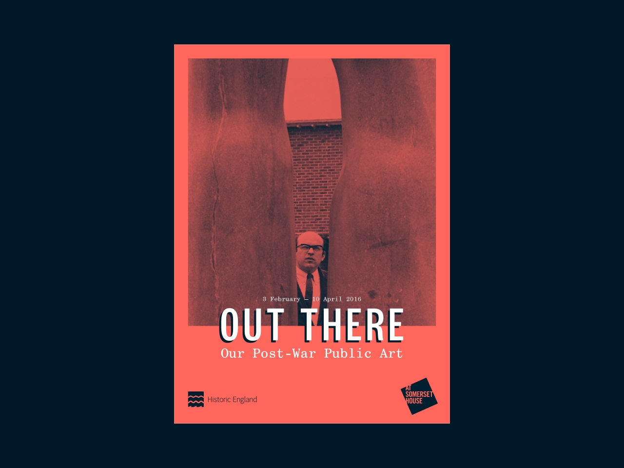
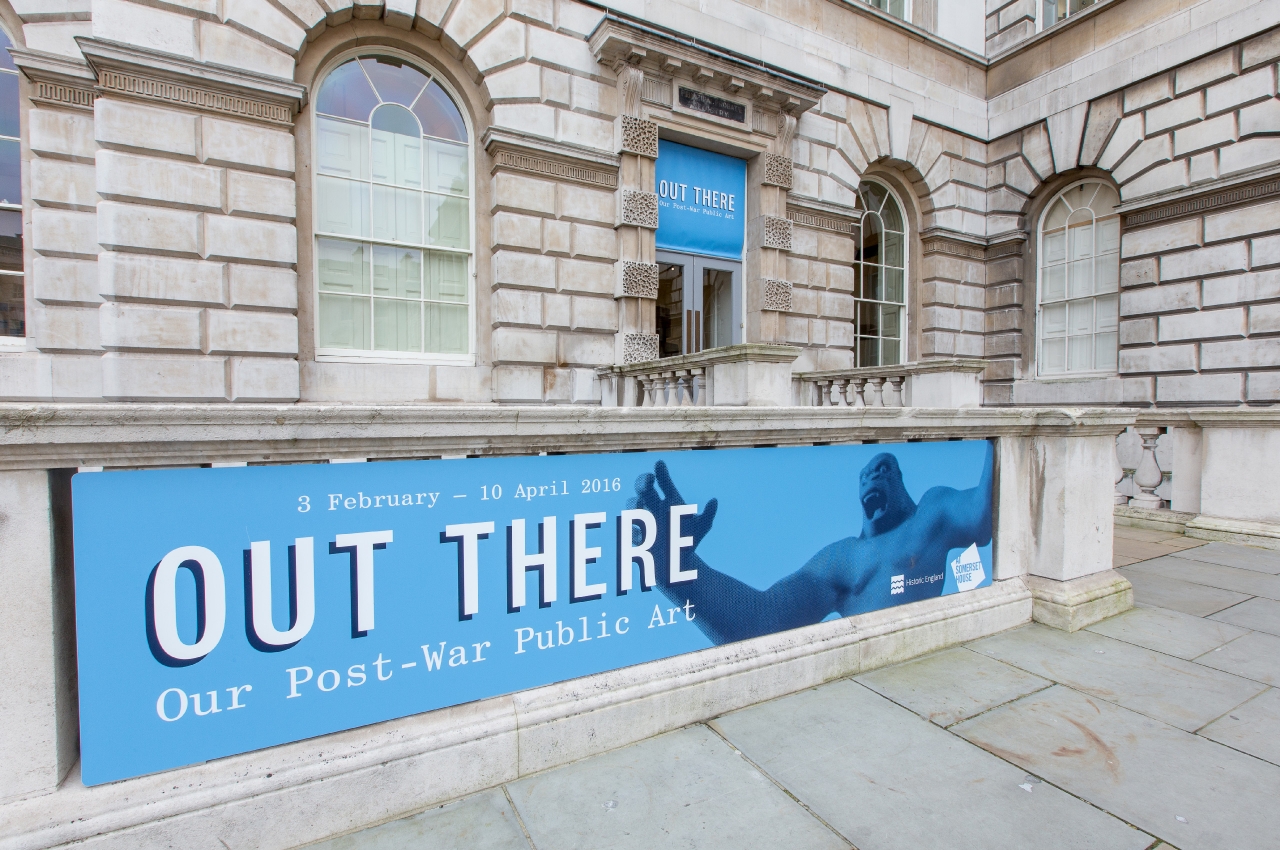
Identity and exhibition design commissioned by Historic England for the exhibition Out There at Somerset House. It explores post-war public art in Britain and focuses on the people and stories behind the pieces.


We had access to a brilliant photographic archive from the period and were struck by the less formal images of people interacting with the public art. This became the photographic theme for selecting images to promote the show, such as the sceptical man between the Hepworth on the main poster.

Curated by Sarah Gaventa for Historic England

London Institute of Photography

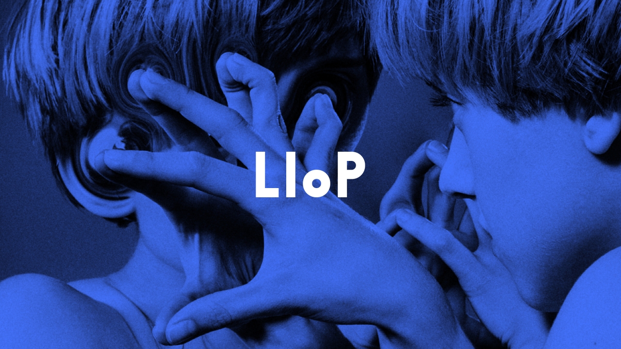
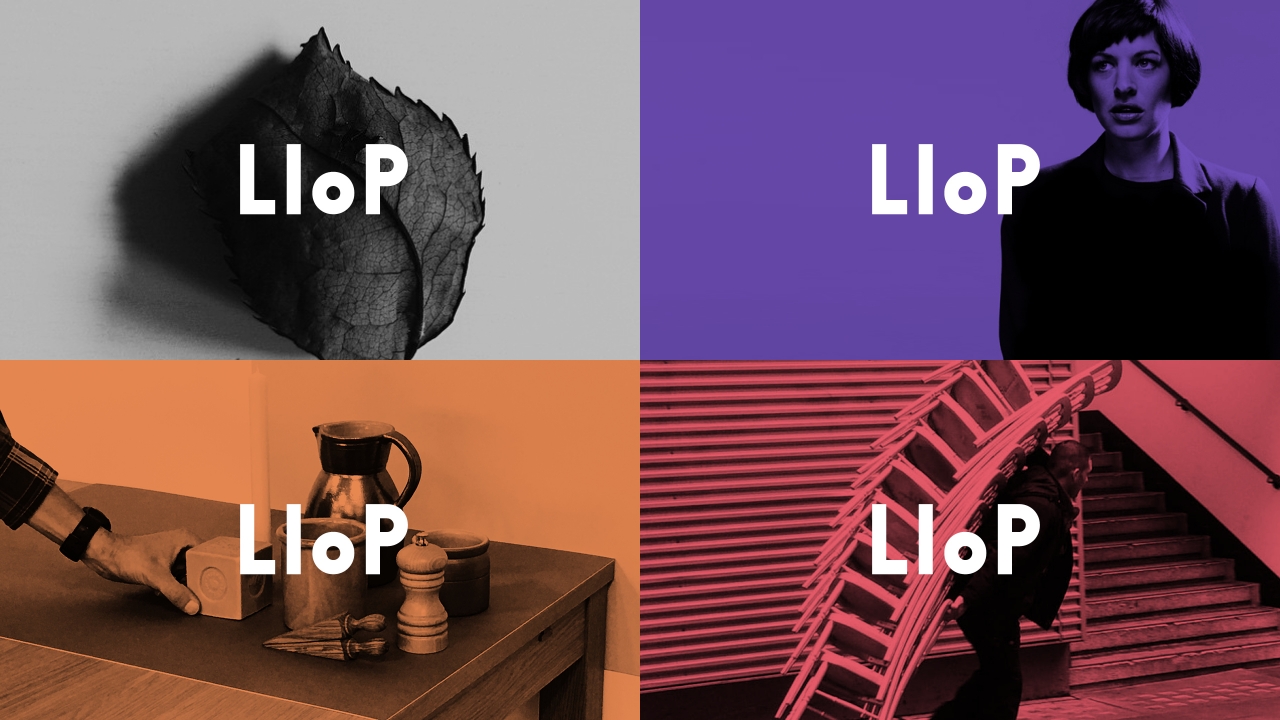
Identity for LIoP. It utilises a constructed typeface built from modular blocks — much like how the courses are taught in building blocks of individual units. The bright colours are inspired by photography test cards.

Photography by Holger Pooten
Initial website developed by Neal Fletcher

Paper Moon

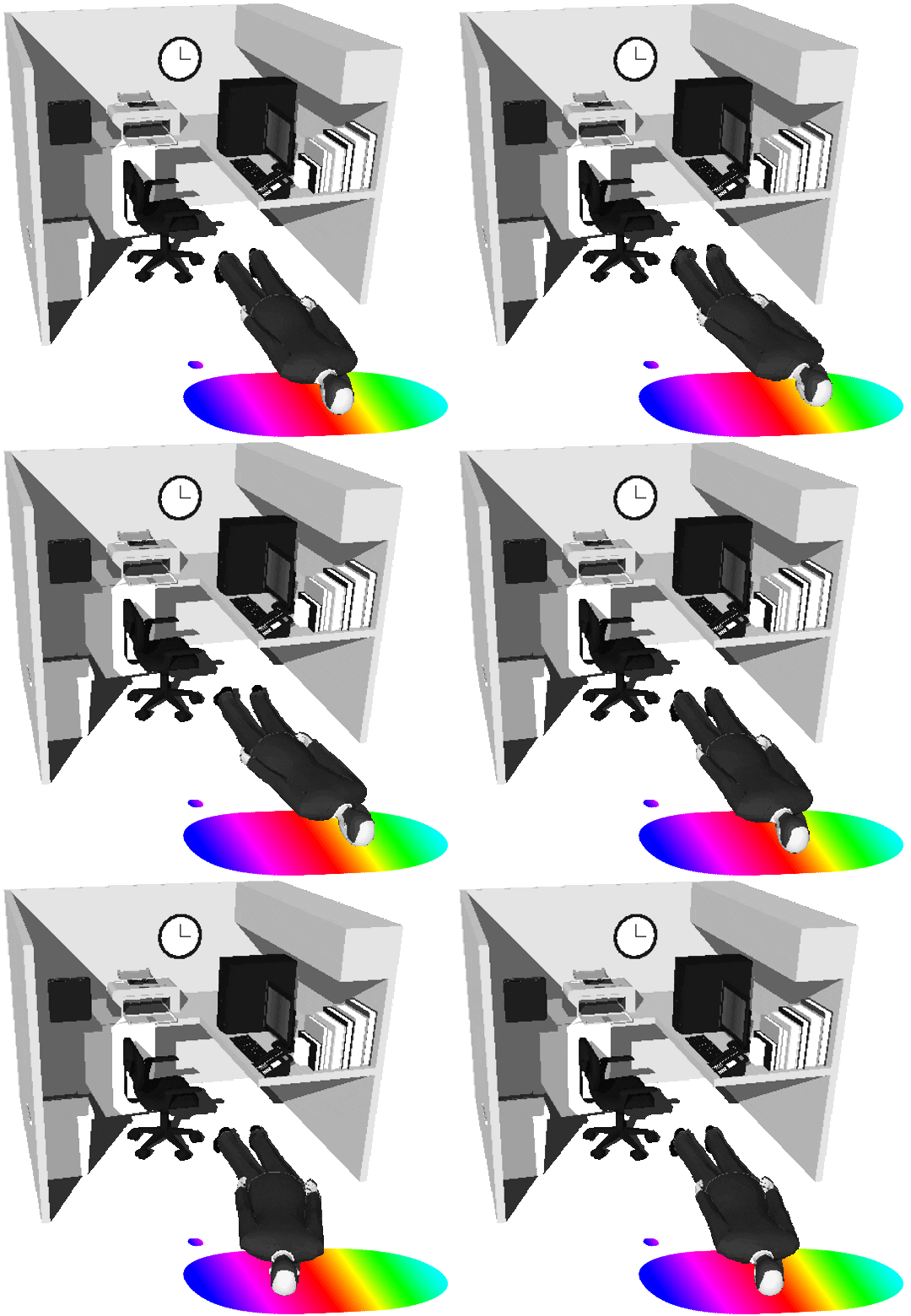
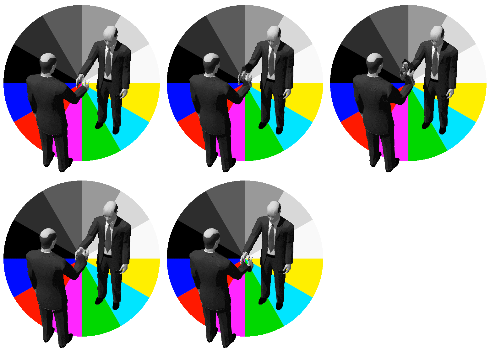
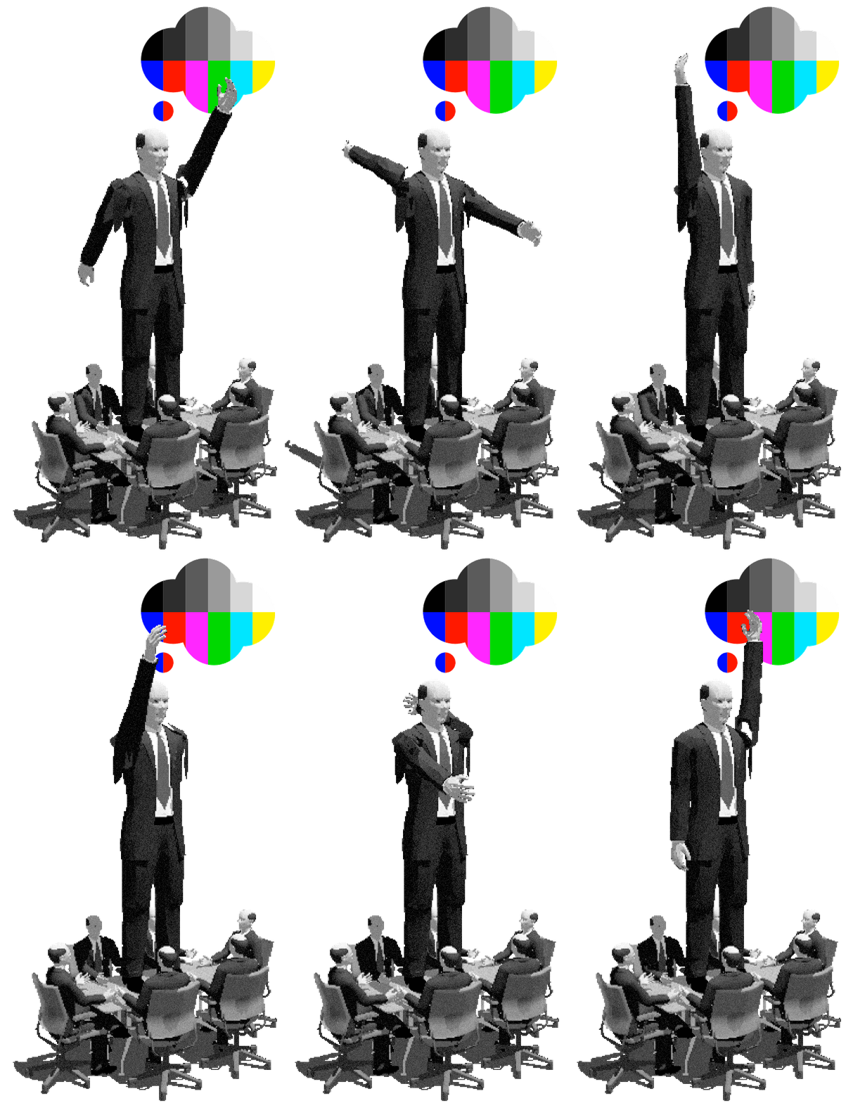
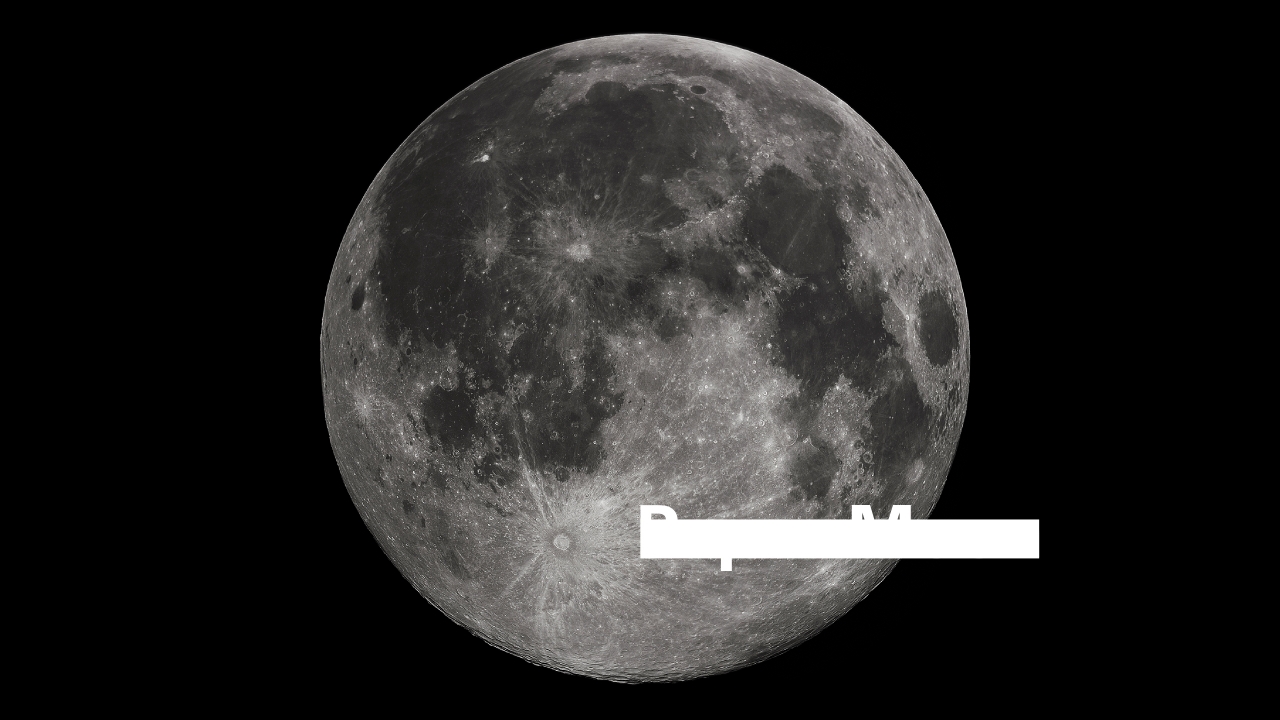
Exhibition concept and design for the show Paper Moon held at the V2 Institute of Unstable Media, Rotterdam, Netherlands. It explores historic and emerging legal and economic consequences of prospective Outer Space ownership and control. A conscious effort was made to avoid the stereotypical sci-fi aesthetics of space, as all decisions regarding Outer Space are made in an office environment on Earth. The theme of the office is used to communicate and bind the investigations together.

Exhibition content and design with Ilona Gaynor, with research assistance by Benedict Singleton

The Department of No

Identity for the design, research and investigation studio. The primary aim was to create a symbol which is strong, direct and mysterious. Inspiration was taken from public order signage (ie. No Smoking), optical illusions, marine dazzle patterns, document stamps, cult iconography and classic bank logos. The shape also represents an ‘N’ and ‘O’. The logo does not explain itself and is often used only as an identifier without accompanying typography.

Work completed with Andy Lang and ongoing

Paramount

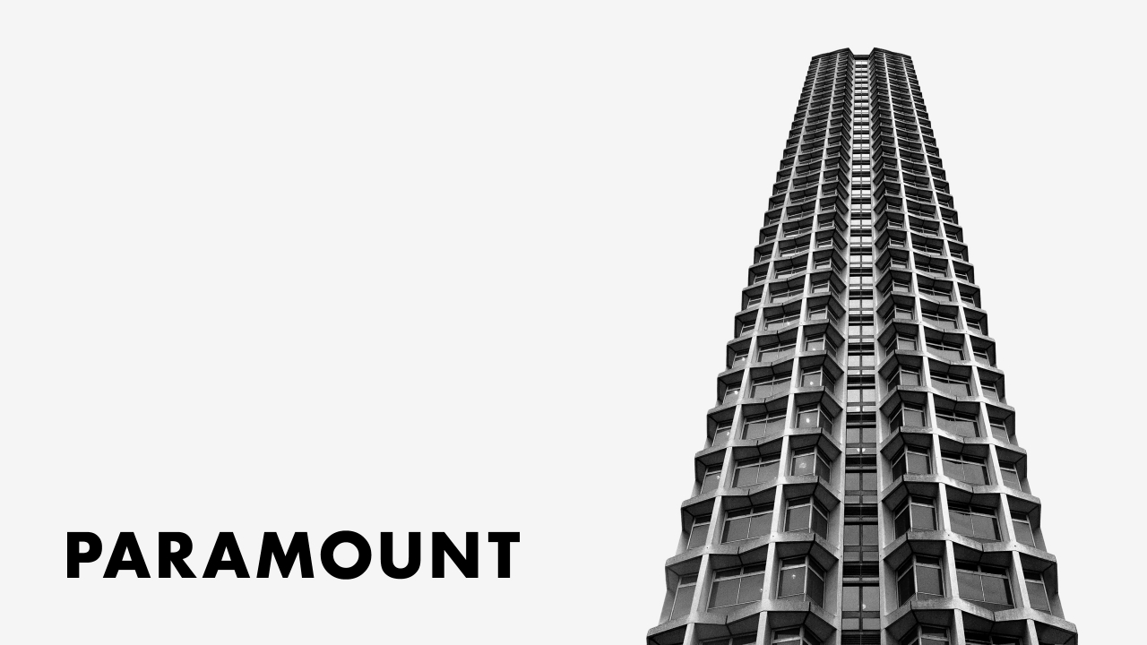
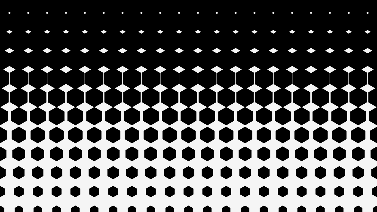
Identity, stationery, printed items, signage and interior elements for a private members’ club located in the top 3 floors of Centre Point, London. The identity is a set of rising patterns based on the graphic shapes found in the buildings architecture.

Work completed at Mind Design
Interior design by Design Research Studio
Interior photography by Ed Reeve

The Collection

Identity for a West London Restaurant. The idea is based on artist multiples, limited editions and signatures. The logo is the owner’s handwriting which was then edited electronically and given specified curve limits to create a kind of synthetic signature. All of signage is created using a series of A5 cards which are screen-printed while constantly adding different inks.

Work completed at Mind Design
Interior design by Design Research Studio

Never Mind The Bollards

An installation in South Crescent, London commissioned by New London Architecture which explores design in public spaces. The focus was on elements which often get overlooked; such as bollards, manhole covers and railings etc. The design uses patterns found on these industrial objects with coloured planes used in public information.

Work completed with Virgile Janssen
Curated by Sarah Gaventa

Playlab

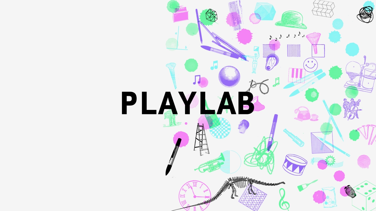
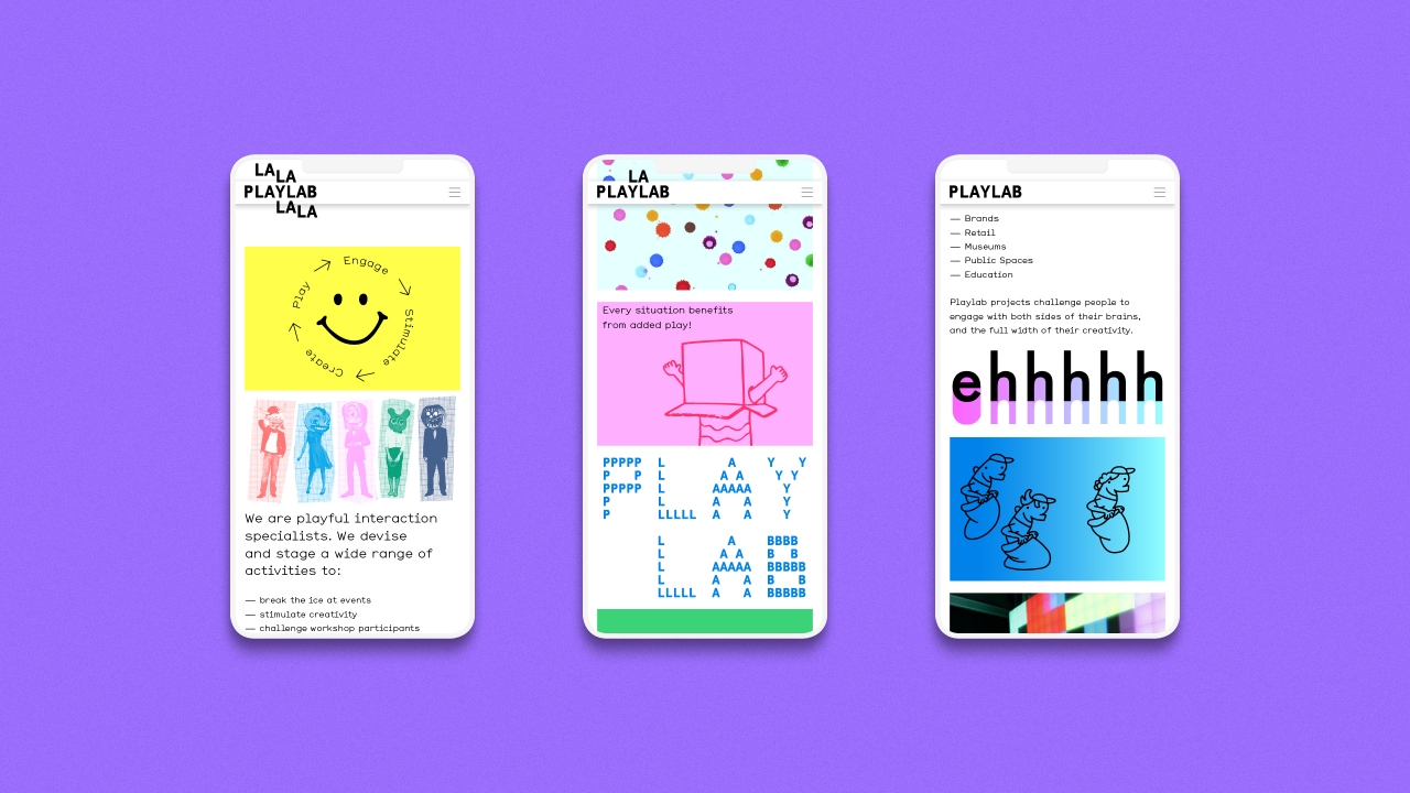
Identity, stationery and website for a company who celebrate the link between play and creativity. They run creative workshops and events using a wide variety of digital and physical mediums. The design is a mix of laboratory with an ‘anything goes’ attitude, to match the companies ethos.

Completed at Mind Design and ongoing